Visualizing Patient Progress: How Spider Graphs Track Rehabilitation Outcomes
- Orlando Rehabilitation Hospital
- Aug 1, 2025
- 3 min read

Rehabilitation is more than physical therapy and checklists. It's a journey full of victories, breakthroughs, and "I did it!" moments. But how do we show that progress in a way that everyone can understand? Enter the spider graph: a colorful, circular chart that brings patient outcomes to life.
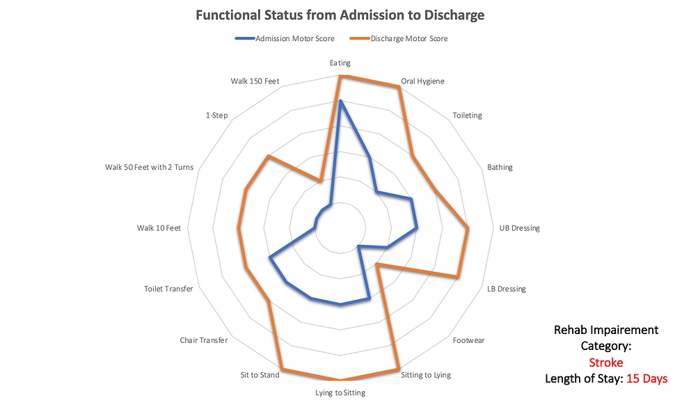
At Orlando Rehabilitation Hospital, we use spider graphs to illustrate the progress that every patient makes. These charts capture a patient’s functional status from the moment they arrive to the day they leave our care.
What’s a Spider Graph?
A spider graph, also called a radar chart, is a circular graph with spokes like a wheel or (you guessed it) a spider web. In medical rehabilitation, each spoke represents a daily activity, such as walking, dressing, bathing, and more.
We score patients using a standardized system and then plot those scores on the graph at admission and discharge. The goal? Demonstrate the significant progress a patient has made in mobility, communication, and overall function.
The visual format makes it easy to compare two key moments in a patient’s rehab journey: the moment they begin rehabilitation and the moment they complete their plan of care with our team. It can also be a helpful visual tool to spark conversations with caregivers and patients considering inpatient rehabilitation, as well as to establish goals and realistic expectations for ongoing improvements after a disabling injury or disease.
Each spider graph includes 15 important activities that most of us do without thinking but are significant to our patients. Here’s what we track:
Self-Care:
Eating
Brushing teeth
Going to the bathroom
Bathing
Getting dressed (upper and lower body)
Putting on shoes
Mobility & Transfers:
Getting in/out of bed
Sitting and standing
Transferring to/from chairs and toilets
Walking & Movement:
Walking 10 feet
Walking 50 feet with turns
Walking 150 feet
Going up one step (think: curb or porch)
Each category gets a score using a standardized measurement system. The higher the score, the more independently the task can be performed. Scores are plotted on a scale that ranges from dependent (0) to independent (6), and the difference between admission and discharge indicates just how far the patient has progressed.
Plot the data, and you’ve got a spider graph that tells the story of functional gains. This format allows everyone involved in the patient’s care to visualize improvement across all aspects of daily life .

Why Clinicians Love It
Medical paperwork can be overwhelming. Long paragraphs, unfamiliar terms, and test scores? No thanks. Spider graphs skip all that. When a patient’s scores improve, their shape on the graph spreads outward like a blossoming flower. It’s the most straightforward way we know to say: “Look how far the patient has come.”
Care teams use it to tailor therapy and stay motivated right alongside the patient.
Hospitals and referral partners can compare outcomes and see real, measurable results.
We’re all about transparency, data-driven care, and patient success. Spider graphs are one of our favorite tools for showing off the amazing things our patients and therapy teams accomplish together. Most importantly, they help us put the spotlight where it belongs—on the patient’s achievements.
In short, spider graphs make success easy to spot and even easier to celebrate.
Delivering Results-High Quality Outcomes
Imagine someone who arrives unable to walk or stand without help. At admission, their spider graph is a tiny shape in the center of the chart. But by discharge? That shape stretches outward like a starburst, showing restored strength, improved mobility, and renewed independence.
And it’s not just about the big gains. Even seemingly small improvements, as we mentioned earlier, such as being able to brush their teeth or put on their shoes, can make a significant difference in a patient’s quality of life.
In today’s world of value-based care, proving your impact is just as important as providing it. We use spider graphs alongside other tools to make sure every rehabilitation story is told clearly and accurately.
So, if you’re curious about how we measure success or just want to see what real rehabilitation improvement looks like, ask us about spider graphs. We’re more than happy to share more examples.
Ready to See the Difference?
Whether you're a family making care decisions or a clinician looking for strong rehab partners, Orlando Rehabilitation Hospital has you covered. Our outcomes are real, our data is transparent, and our commitment to helping patients reclaim their independence is second to none.
Contact us today or visit our website to learn more about our rehab programs and how we’re turning small steps into big wins, one spider graph at a time.


